18 April 2024
Published by
Selecting the right color codes for your mobile app can significantly impact user experience, brand perception, and even functionality.
In this article, we will guide you through the process of choosing the perfect color codes for your mobile app, considering various factors that contribute to a successful and visually appealing design.
Begin by understanding the basics of color theory. Keep it simple – warm colors like red and orange evoke excitement and energy, while cool colors like blue and green create a calm vibe and serene atmosphere. Consider the emotions you want your users to feel and choose colors accordingly.

Your app’s colors should align with your brand. Consistency builds recognition, so choose hues that represent your brand identity. Think of popular brands like Facebook’s blue or Instagram’s vibrant gradient – their colors are instantly recognizable.
Ensure your color choices are accessible to everyone. High contrast is essential for users with visual impairments. Use readable color combinations and be inclusive to cater to a diverse user base.
Stay updated with current design trends, but find a balance. Trendy colors can make your app feel modern, but timeless choices ensure long-lasting appeal. Explore popular color trends in the mobile app industry and consider how they align with your brand and user preferences.
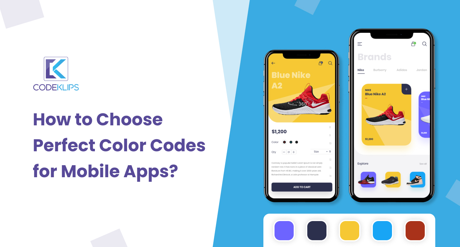
Choosing the perfect color combination can be challenging so take advantage of color palette generators like Adobe Color Wheel or Coolors can help you discover harmonious color scheme. Experiment with these tools to find combinations that resonate with your app’s purpose and target audience.
After selecting a color scheme, it’s time for A/B testing. This testing helps you to compare the performance of different color variations and gather valuable user feedback. The process is iterative, so be open to refining your choices based on user preferences. Remember, the color selection process is an ongoing journey of refinement.
Be mindful of common mistakes, such as overusing vibrant colors or ignoring cultural connotations. Thoughtful color choices enhance the user experience and show a deep understanding of your audience.
Colors play a crucial role in guiding users through your app. Use color differentiation for easy navigation.
Consider the psychology of color in navigation – for example, using green for positive actions and red for alerts.
Thoughtful color application contributes to a user-friendly and intuitive experience.
Consider that your app may be used on both iOS and Android. Adapt your color codes to ensure consistency and visual appeal across different devices. Additionally, consider how colors appear on different screen sizes, optimizing for readability and user experience.
Study successful and unsuccessful examples. Learn from popular apps and their color strategies and the pitfalls to avoid. Case studies provides real-world examples that can inform your decision-making process and inspire innovative color choices.
Different app categories have different expectations. Productivity apps may benefit from calm and focused color palettes , while entertainment apps can experiment with bold and vibrant colors. Tailor your color scheme to match atmosphere of your app, considering the preferences of your target audience.
Anticipate the future by choosing a color scheme that is scalable and adaptable. Trends change and what’s trendy today may become outdated tomorrow so aim for a scheme that can withstand the test of time, with flexibility to adjust to emerging design trends.
Gather insights from experienced mobile app designers. Learn from their experiences and stay informed about industry best practices. Expert advice goes beyond the basics and can inspire innovative color choices.
Choosing the perfect color codes for your mobile app is a blend of creativity, psychology, and functionality. Keep it simple, stay true to your brand, and consider the diverse needs of your users. By following these simple guidelines, you’ll create an app that not only looks great but also provides an enjoyable user experience.