
28 June 2024
Published by
In today’s world, Where smartphones have become an extension of our lives, lots of people use their phones for everything, so it’s super important for businesses to make sure their apps work well on mobile.
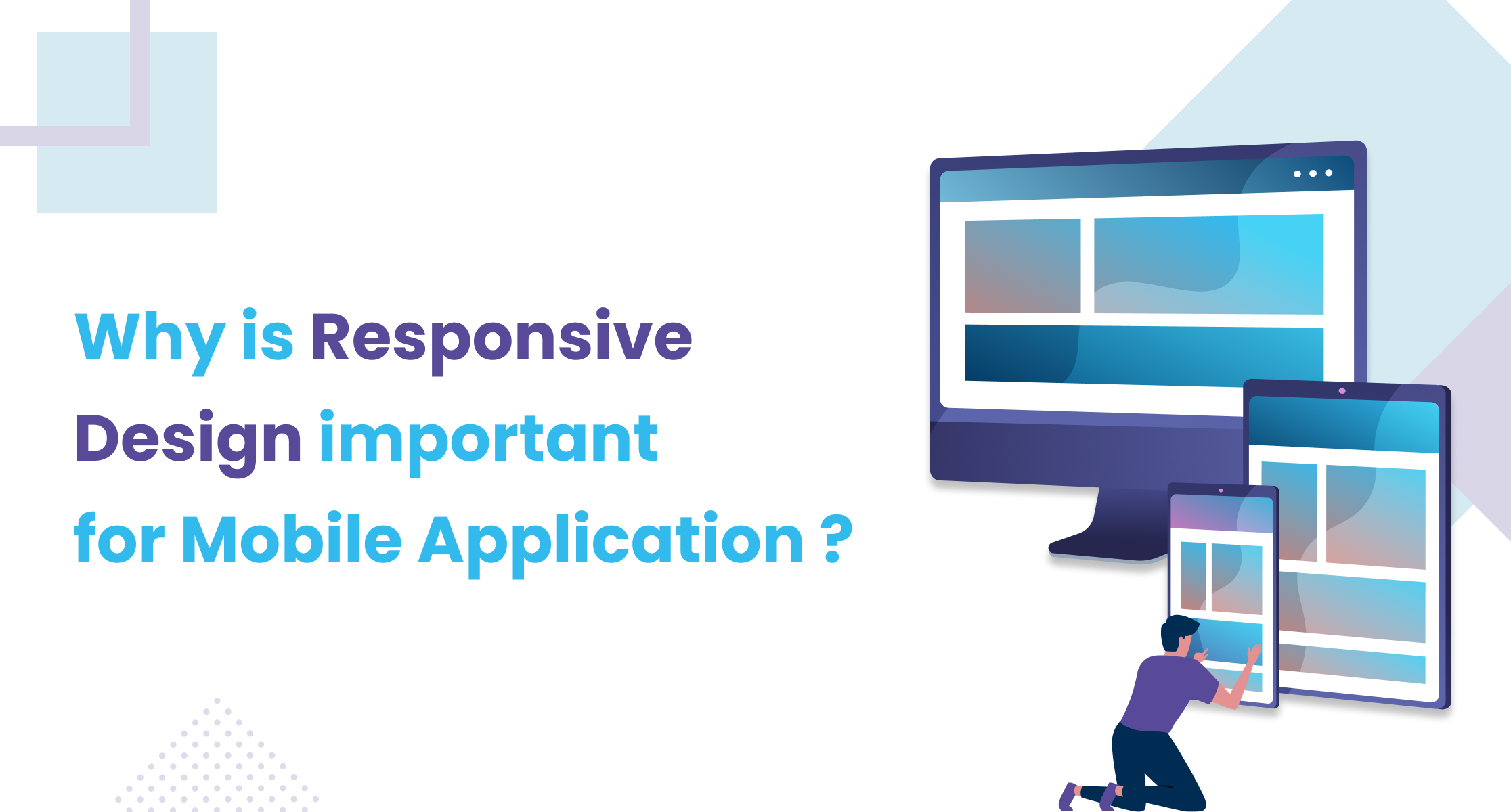
Responsive design is all about making apps that adjust to fit different screens, whether on a phone, tablet, or computer.
Responsive design is a big deal because everyone’s using their phones and tablets all the time. When people download an app, they want it to look good and work smoothly no matter what device they’re using. That’s why it’s crucial for businesses to focus on making their apps responsive.
In this article, we’ll provide the guidance of the importance of responsive design for mobile apps with examples.
Understanding Responsive Design
Before we proceed into its importance for mobile apps, let’s first learn the concept of responsive Design.
● What is Responsive Design?
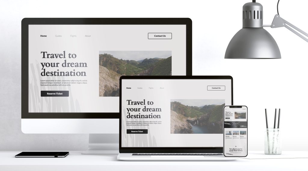
Responsive design is all about making sure websites and apps look great and work well on any device, like computers, phones, or tablets. It’s like having a magic trick that automatically adjusts everything – from how things look to how you interact with them – depending on the size and type of screen you’re using. So, whether you’re on a big computer screen or a tiny phone screen, the experience stays awesome. It’s like having a friend who’s always there to help you out, no matter what device you’re using. That’s the magic of responsive design!
● How Does Responsive Design Work?
Responsive design uses clever tricks like flexible grids and layouts, along with special codes called CSS media queries, to make websites and apps look great on any device. Instead of making different versions for each device, developers create one design that magically adjusts to fit screens of all sizes. It’s like having one outfit that can shrink or expand to fit anyone – making sure everyone gets the best experience, no matter what device they’re using!
Importance of Responsive Design for Mobile Apps:
There are several reasons why responsive design is important for mobile apps:
● Improved User Experience: One of the primary reasons why responsive design is crucial for mobile apps is the enhanced user experience it offers. With responsive design, mobile apps can adjust their layout and content dynamically based on the screen size and orientation of the device. This ensures that users can easily navigate through the app and access its features without any hassle, leading to higher satisfaction levels.
● Accessibility Across Devices: Making mobile apps accessible is really important. By adjusting how the app looks and what it includes for different devices, developers can make sure everyone, including people with disabilities or those using assistive tools, can use it easily. This approach doesn’t just make the app available to more people; it also shows that the developers care about including everyone.
● Better SEO: Responsive design can also have a significant impact on the app’s SEO performance. Search engines like Google favor mobile-friendly apps, so a responsive design can help improve your app’s ranking in search results. This is because responsive apps are more likely to provide a good user experience on all devices.
● Reduced Development Costs: Developing and maintaining separate apps for different devices can be expensive and time-consuming. Responsive design allows you to create a single app that works on all devices, saving you money and resources.
Why Does Responsive Design Matter?
Let’s take a look at a real-world example of why responsive design matters, With and without responsive design. This makes you easily understand how responsive design works and why it’s important for Mobile Apps
Real-life Example: Instagram app
The Instagram app is one of the most popular apps among all people.
Now just imagine trying to use an Instagram app on your phone, but it’s all squished or doesn’t fit right on the screen. That would be frustrating, right?
Desktop Version: Instagram on a desktop would require horizontal scrolling and may appear cramped on larger screens.
Mobile Version: Users would struggle with small elements and might need to zoom in to interact with the app comfortably.
Tablet Version: Similar issues as desktop and mobile, with wasted space or awkward layouts on larger screens.
People who have disabilities or need assistive tools might find it hard to use the app because it doesn’t adjust well. Their screen readers and other helpful tech may not work smoothly with the app’s fixed layout. Also, users switching between devices would face varying experiences, potentially leading to frustration and dissatisfaction.
With Responsive Design:
Responsive design fixes that by making sure the app looks and works great on any device. and solve all the above problems and make it user-friendly
The Instagram app with responsive design dynamically adjusts its layout and content to fit various screen sizes and resolutions, ensuring an optimal viewing experience across devices such as smartphones, tablets, and desktop computers. This means that whether you’re accessing Instagram from a small mobile phone screen or a large desktop monitor, the app’s interface elements, images, and text will adapt accordingly to provide a seamless and user-friendly experience.
When businesses invest in responsive design for their apps, it keeps users happy and engaged. And happy users are more likely to keep using the app and recommend it to their friends. So, it’s a win-win situation for everyone!
If you’re still not convinced that responsive design is important for mobile apps, consider the following:
Most people use phones to browse the internet, and that’s only going to grow. Users expect a seamless experience across all devices. If your app is not responsive, you’re going to disappoint your users. Making apps flexible also helps them show up better in online searches.
In conclusion, responsive design is not just a preference but a necessity for mobile apps in today’s digital landscape. By prioritizing responsive design principles, app developers can deliver exceptional user experiences, improve accessibility, boost SEO ranking, and streamline development processes. Real-life examples like the Instagram app highlight the tangible benefits of responsive design implementation, underscoring its importance in creating successful mobile applications.
At Codeklips, we understand the importance of creating apps that adapt seamlessly to any device. Let’s craft your next app together for maximum impact. Reach out to us today!
We hope this blog post has helped you understand the importance of responsive design for mobile apps. If you have any questions, please feel free to leave a comment below.